Nextiva


An audit as old as time
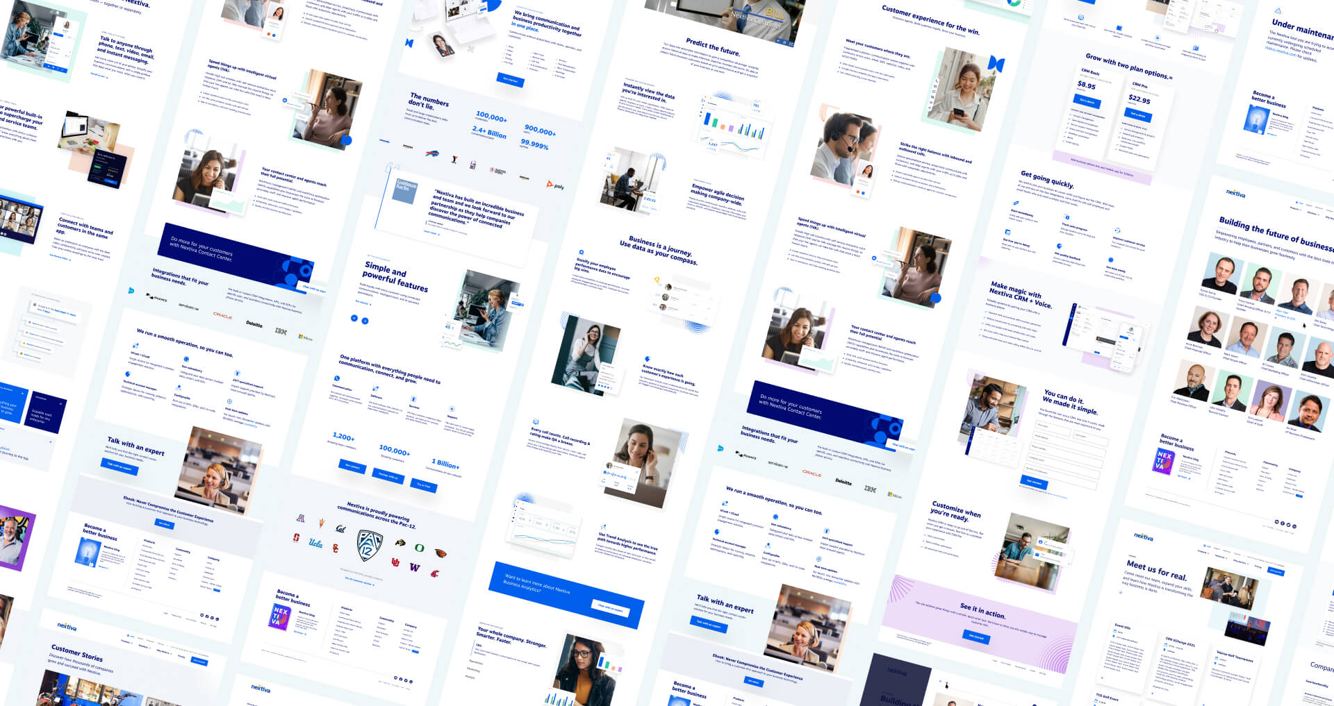
Nextiva.com was built with artisan, bespoke, all natural, hand coded HTML. This allowed the developers to move exceptionally quickly and deliver high quality pages on a moments notice. It did, however, make maintainance a nightmare. Many pages were outdated, broken and off brand.
One of my first goals was to begin refactoring these older and neglected pages. This work could be done alongside current projects, without interrupting the cadence of new campaigns and product launches.
Pages were prioritized based on prominence, traffic and divergance from brand standards. If a page was slightly off brand but performing well it was better we focus our efforts on pages that were extremely outdated and ill performing.
In my first 6 months, 19 high traffic pages were refreshed and pushed live as part of this project.
design-systems.v1
In conjunction with the audit there was a clear need to create a design system for Nextiva’s web presence. It’s simply not possible to maintain a website of this scale on a per page basis. While a system had been discussed in the organization it never gained traction and unfortunately had many false starts.
To get buy-in from team members, we started small. By identifying and building one of the simplest components (buttons) we were able prove the value of the system. This gave us the greenlight to begin creating a v1 system in earnest.
The creation of the v1 system started with an audit. Screenshots of content and components used throughout the site were collected into a single Figma file allowing us to idenfity patterns that could be repeated page to page.
Foundations (type, colors, shadows, etc.) were quickly defined based on gleanings from the audit and a component list was created to match the content needs identified in the pattern matching excersize. These were integrated by the development team as SCSS partials in global stylesheets.
Soon after, visual design began on each component. The goal of the work not being a redesign but rather an alignment towards a cohesive brand and a cohesive code base. As visual design began nearing completion development picked up the project. They opted to use Storybook to help manage and document each component.
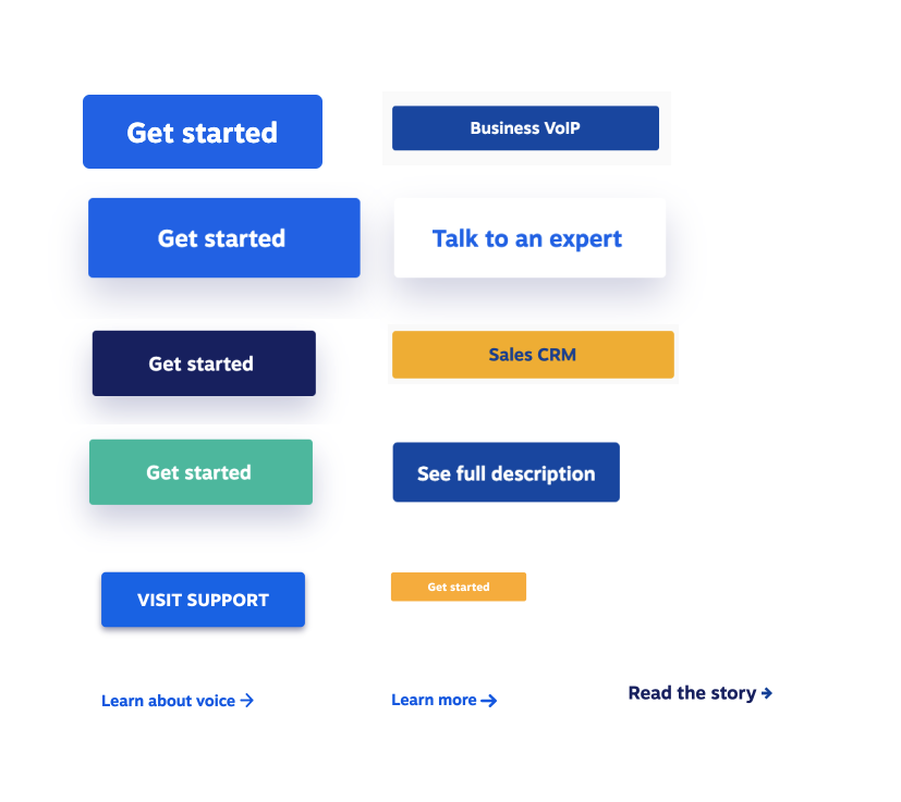
A selection of buttons pulled from the audit process
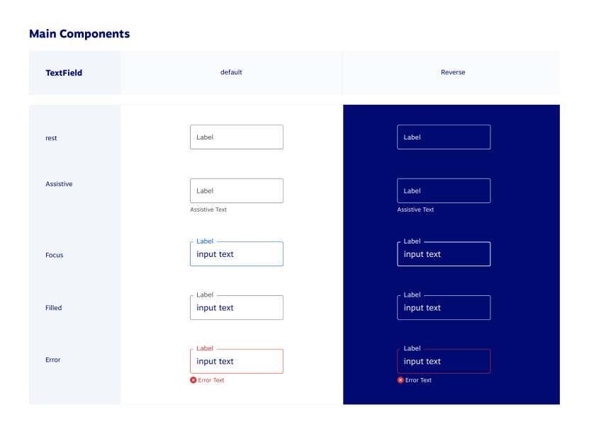
Text field states
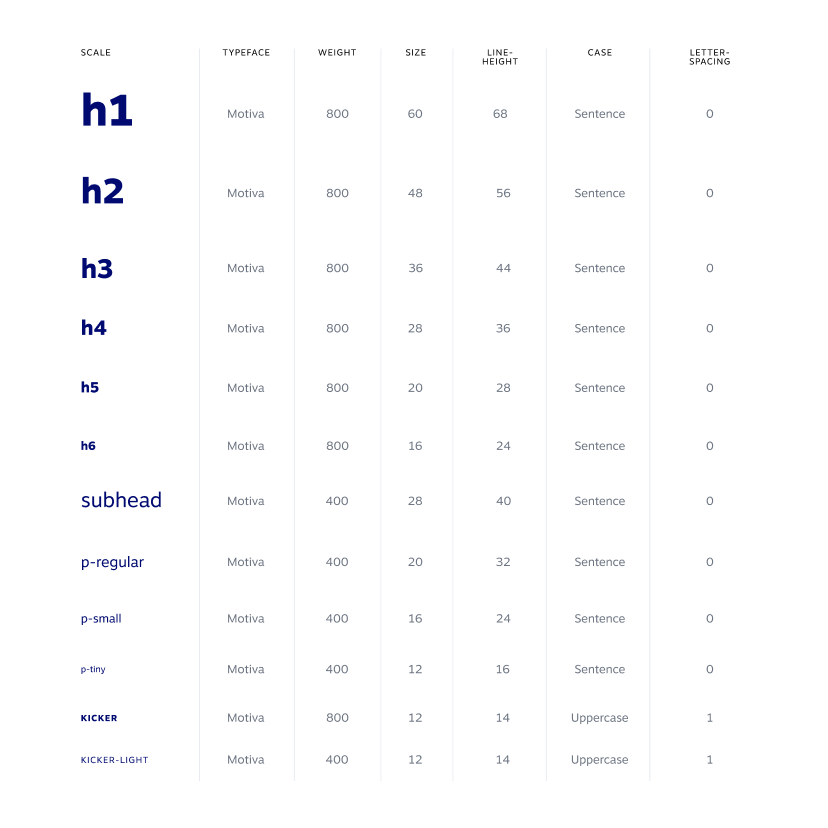
Typography
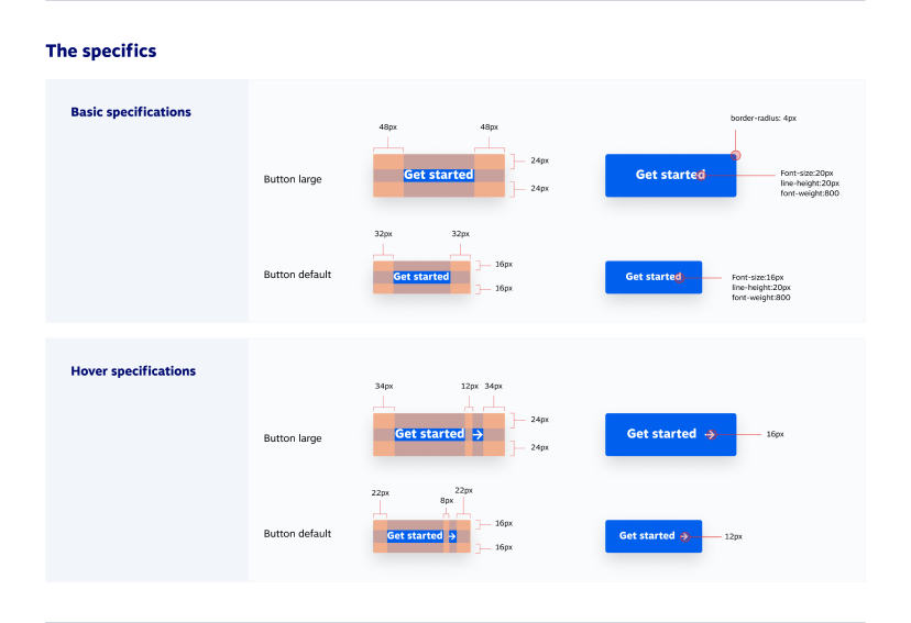
Button details
Established visual language
The brand itself is comprised of simple geometric shapes and a blue/white primary color palette. Secondary colors are bold seperations from the tech centric branding allowing Nextiva to stand apart from the competition.
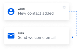
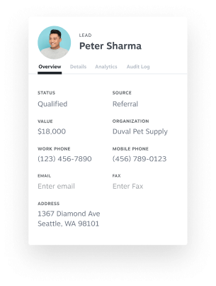
Product illustration consists of simplified screenshots of Nextiva’s products. User testing revealed a strong desire for these screens, often desiring to see greater detail in each image. This testing also allowed us to see what specifically should be called out in an illustration and what elements might be better off hidden.


